Blog post
Design trends are more varied than ever, and clients are more willing to experiment — often at the cost of placing distractions in primary focus while ignoring the very basic principles of UX.
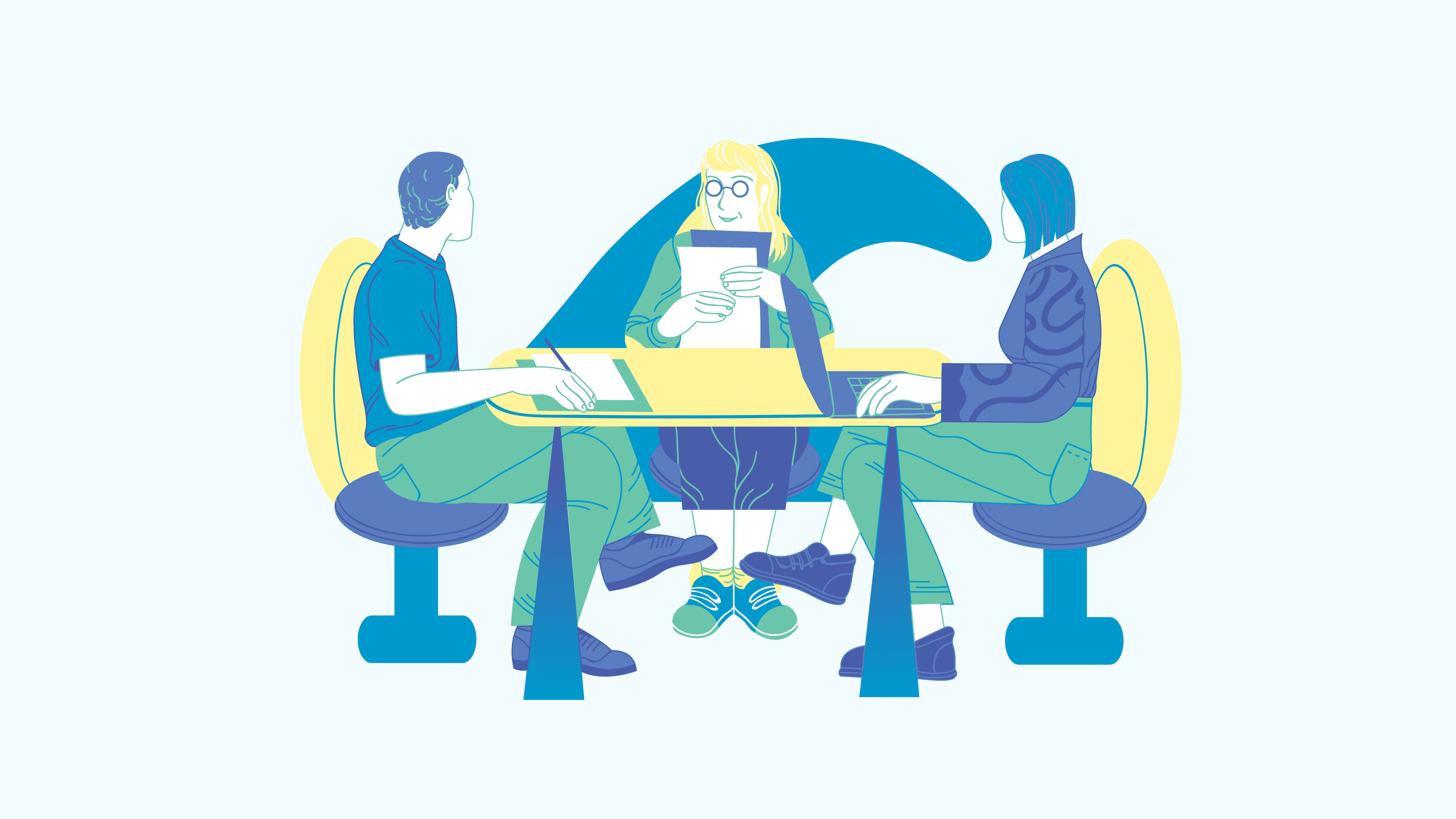
Designing and developing a website isn’t an act; it’s a journey. And like any journey, it starts with decisions. Designers need to decide with the clients on the style they want to see in the future website, which often means figuring out how to reconcile a personal need for aesthetically pleasing, innovative solutions, with demands for usability and clarity. This dilemma is especially evident in cases where designers choose to follow a certain trend. But should there even be a dilemma?
Do we design for humans or awards?
If you visit a newly created website that follows the latest design and technology trends, you will likely be greeted with an animation that disorients or test your patience. The website might hijack your mouse or ability to scroll. The content may come from unexpected directions, and headings might appear huge on devices larger than laptops, forcing you to move away from the screen to read them. Since these far too large captions often appear hand in hand with tiny labels, it would be a good idea to keep a magnifying glass in your pocket — one you can also use to look for the navigation, often hidden somewhere on your screen.
It seems many things we have come to understand about users are easily forgotten. Simple principles, such as giving the user information about where they are on the website, or allowing them to navigate with ease, don’t seem to be relevant anymore. What does seem to matter is having the “WOW” factor that might impress clients or even pick up an award or two. However, to some of us, this is more concerning than inspiring.
Where is UX in today’s trends?
Is UX still the Holy Grail?
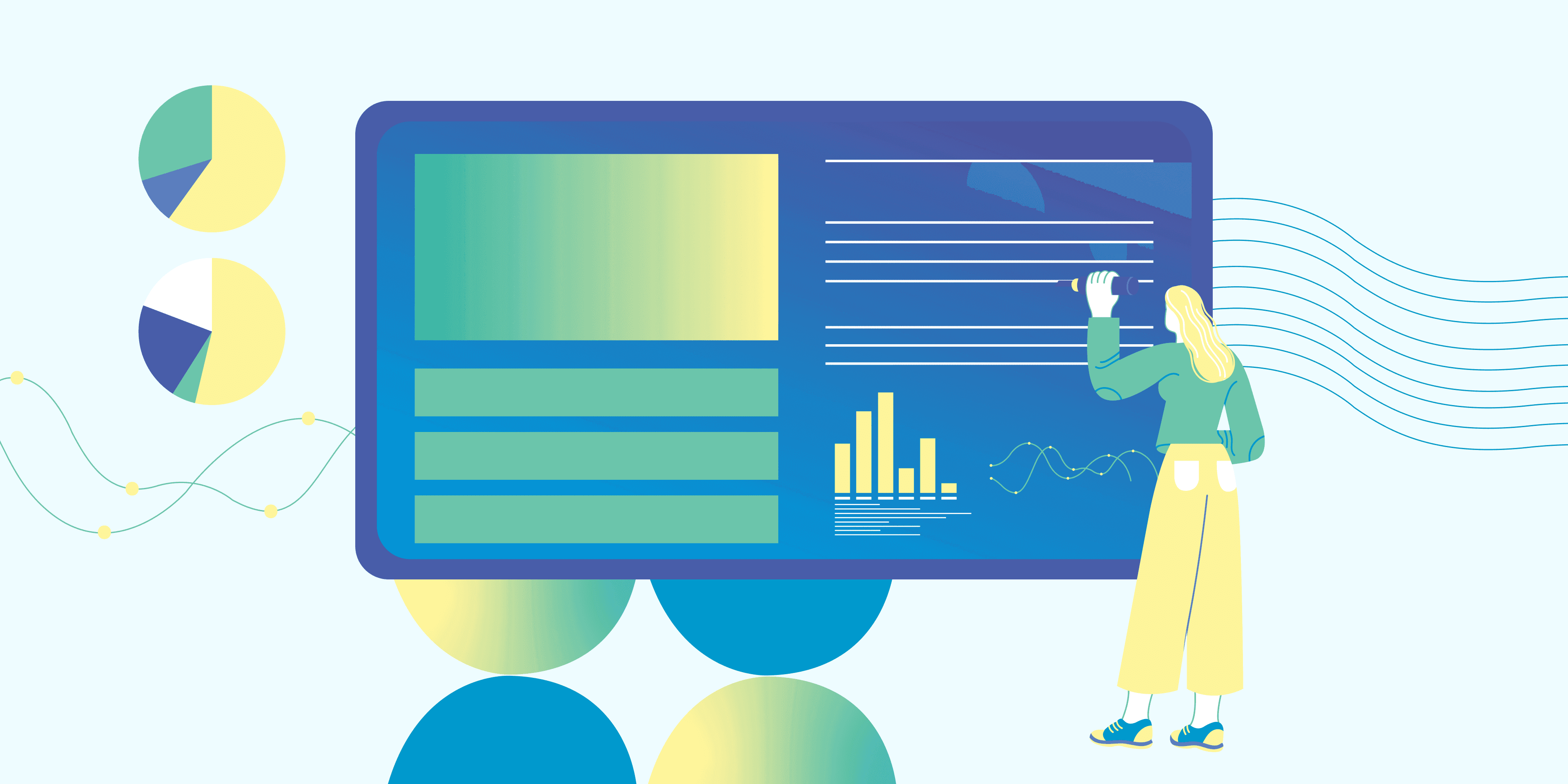
UX has become more than just a buzzword over the last couple of years, with agencies putting effort into continually evolving their UX process through workshops with clients, various user research methods, user personas with emotions and interests, user journeys, user flows, wireframes, prototypes, and usability tests. There has been so much focus on acquiring specific metric data regarding UX, yet we still decide to sacrifice good UX for a “prettier” and “trendy” UI.
Of course, when designing a new website, we want to be different, use the latest technology, and show off our design skills. Still, we should ask ourselves if it’s worth changing proven UX models for a new trick that ignores existing user behaviors and creates unnecessary challenges.
Content — a king without a throne
When talking about the topic of UX, you often hear the phrase “content is king”. But is it really? When creating new websites, do we place content at the center of the user’s attention, or are we more focused on following the latest design trends?
When users need to focus on the content, the last thing you should do is distract them with mindless animations, aggressive backgrounds, and text color changes. We should think carefully about possible distractions and use them only when we want to shift the user’s focus in a new direction, yet new trends often have plenty of those distracting elements.
Miniature additional text, random elements across the screen, weird unexpected behavior, bright unreadable colors, aggressive animations, and wild color changes… Most such things bring no value to the user outside of being trendy.
Hijacking the experience
Making users feel safe and welcome is one of the best approaches of UX that even beginners know.
In an online experience, that feeling of control and safety stems from knowing where you are and how to navigate away from your position. Therefore, changing classic actions like scrolling or implementing mouse pointer modifications could potentially irritate users. If they aren’t comfortable with the newest technology, this could even lead to feelings of confusion and fear — the last thing we want the users to feel.
Here’s a quick example: the built-in browser scroll position is useful implicit information that users are accustomed to. When switching to horizontal scrolling, this information usually isn’t displayed, which adds to the users’ confusion. Scrolling in a different direction than accustomed to while not being able to understand the progress of scrolling sounds like an unneeded hassle.
Users are accustomed to scrolling vertically, they like to know where they are at any given moment, and they expect to intuitively know the browser works. This shouldn’t be broken because of a trend — unless it mimics real-life behavior that the user can relate to.
What would be a case of mimicking real-life behavior?
Horizontal timelines! Users are accustomed to seeing a timeline starting with the earliest or current date, then moving forward horizontally to further dates, or backward to past dates.
This means that changing the scroll from vertical to horizontal could work because it mimics real-life experience. Although timelines can be in different shapes, we all saw this format during our early education, so this representation became the most common and natural one. And there aren’t any intuitive obstacles: since it’s a timeline, users know where they are and are probably aware of when and how it will end, so their current position is clear to them.
This is one of the arguments for implementing horizontal scroll, but we still need to make sure the rest of the content can follow this new set of rules and we can justify hijacking the most common scrolling experience. Also, if we do decide to implement a behavior change in a product, it has to be consistent in all variations where that behavior is repeated.
Stepping into trends
As a designer who has been in this profession for many years, I feel like we’ve seen a lot of trends come and go.
Trends are an interesting phenomenon and worth exploring because any design idea can be great if it’s implemented with a user-centric approach. When choosing the right style, ensure it suits the target audience and the theme, and don’t decide on an idea only because it’s trendy. Finally, even when you do make the final decision, you need to be conscious of its possible flaws.
For example, brutalism can be grandiose if we can achieve high resolutions while maintaining readability, and consider how many bright colors we actually need to get the desired look; or how much lack of color is acceptable for the product to be usable.
Also, always try to focus user attention on the content that guides them in the wanted direction, instead of possible distractions.
In short, following a trend isn’t necessarily a bad idea, but it shouldn’t be done at the cost of UX. Good UX is the foundation on which we build a story, and it’s time to stop looking for excuses to justify ignoring those foundations. Trendy and usable aren’t mutually exclusive!
Finding the middle ground
Of course, there is an exception to every rule. If users are motivated enough, sometimes their time invested into learning how to navigate a website or an app can pay off in the end and provide a more interesting, innovative user experience.
Still, it is important to weigh whether the user really gets additional benefits, if we are taking away their learned behavior or confusing them with distractions. We would need to thoroughly test the new design solution with the target group of users. A/B testing would be perfect for this situation, but it requires additional time and resources to come up with two design solutions. And of course, we would need to emotionally distance ourselves from the preferred solution and maintain objectivity. In fact, the default presumption should be that the simpler, “already seen” solution is probably the one that the test group prefers.
Beware: not taking all of this into consideration can lead you to become a development company that only boasts about the UX conferences it attends or articles it reads and publishes, but in fact doesn’t practice what it preaches.
In conclusion, design trends are exactly what their name implies: styles that are popular at the time. Whether or not you follow a trend shouldn’t be imperative while building a digital product, but if you choose to do so, it should be carefully balanced with our existing knowledge of UX. Our hope is that the world has more designers that focus on user experience and high product usability than design trends.
If you are like me, a person for whom the user experience and long-term contribution of a good UX are more important than trendy design elements, I must cheer you up with the fact that there are companies like Undabot, where we as designers, place top priority on high usability of our products and data that confirms it’s a success.