Blog post
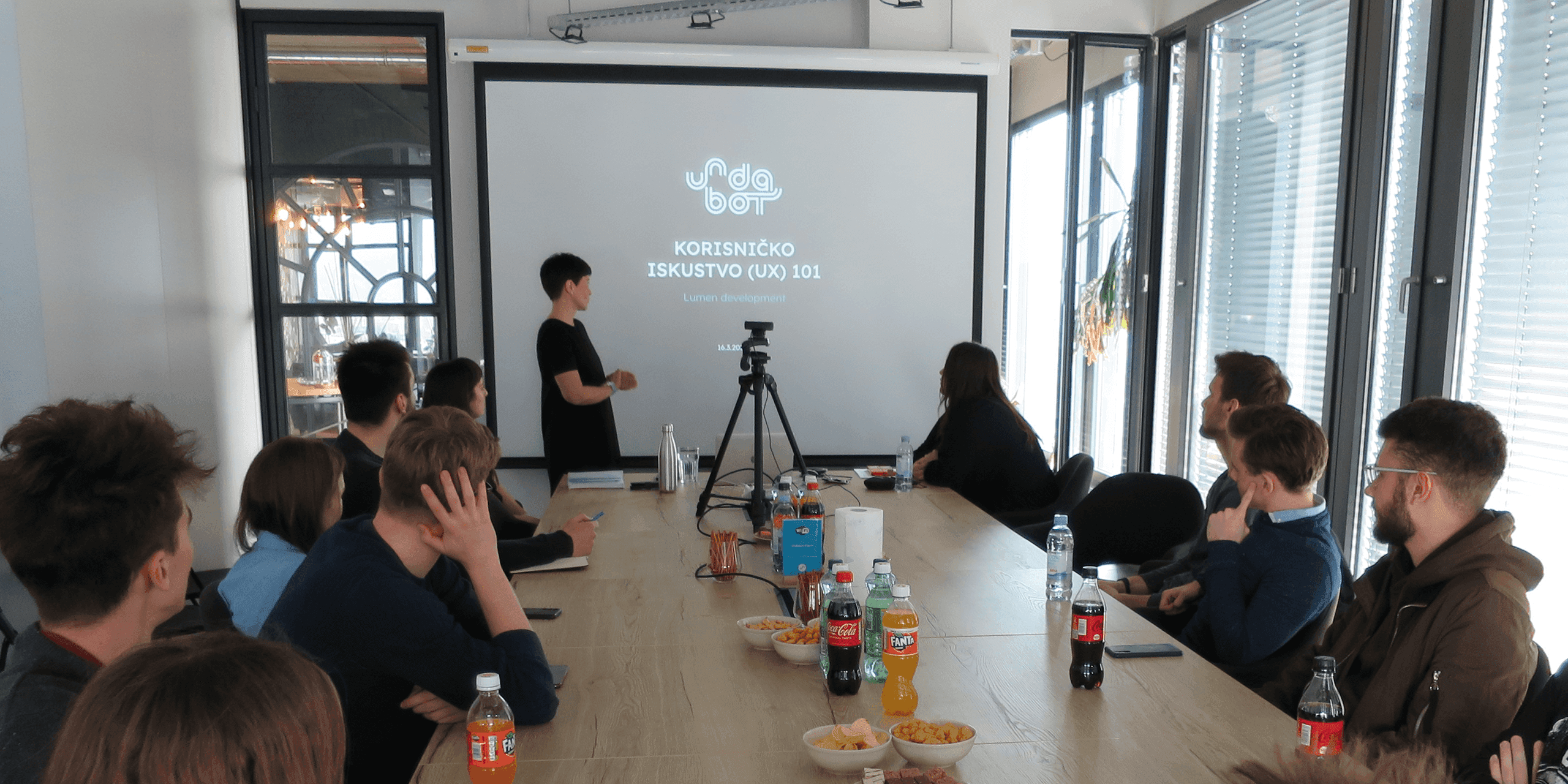
As a part of our mentorship engagement with Lumen Development, we had an opportunity to host a workshop for students participating in the competition in our offices. The competition consists of designing and developing a mobile or web application and is the biggest one of that type in Croatia.
Apart from the workshop, Undabot also provides consultations to teams and shares advice and best practices to overcome all the challenges they might be facing.
Since the teams are creating products from scratch, we decided to host a “UX 101” workshop to help them understand the process behind creating good products for a specific user group.
During the 2.5-hour workshop, we covered the following topics:
- What is UX
- UX processes
- What is bad UX?
- A group assignment
- What are user interface platform guidelines
- How and where to learn from
We finished off with a short quiz on topics discussed during the workshop. The winner received a small gift.
1. What is UX
“User experience” encompasses all aspects of the end-users interaction with the company, its services, and its products.”
We discussed the definition of UX by Don Norman and Jakob Nielsen, the pioneers in this field, and watched a short video of Don Norman explaining the term UX.
One important thing to keep in mind is that there is no “perfect UX”, simply because nothing in life can be perfect. In my opinion, life is easier when you embrace that fact. You can strive for perfection, do the best job you can, but you don’t need to stress too much about it. Our products are used mainly by users of a wide age range, and it is not easy to meet everybody’s needs seamlessly.
Don Norman also says: Focus on Results, Not on Perfect UX.
Psychology plays a big part in UX design. It helps understand the users and influence of human behaviour. Design psychology is a combination of social psychology, cognitive psychology, neuroscience, and human-computer interaction that approaches user experience design through the lens of human behaviour.
Therefore, we discussed some of the principles and theories behind the design decisions backed by psychological principles. You can read more about each principle and theory on the Laws of UX website.
Heuristic
Aesthetic-Usability Effect
Fitts’s Law
Goal-Gradient Effect
Hick’s Law
Jakob’s Law
Miller’s Law
Parkinson’s Law
Principle
Doherty Threshold
Occam’s Razor
Pareto Principle
Postel’s Law
Tesler’s Law
Gestalt
Law of Common Region
Law of Proximity
Law of Prägnanz
Law of Similarity
Law of Uniform Connectedness
Law of Symmetry
Law of Closure
Law of Continuation
Cognitive Bias
Peak-End Rule
Serial Position Effect
Von Restorff Effect
Zeigarnik Effect
Color psychology
Maslow’s hierarchy of needs
UX vs UI
A crucial thing to explain to someone new to this field is the difference between UX and UI and why they are two completely different things.
UX = User experience
UI = User interface
As defined by the interaction design foundation:
“User interface (UI) design is the process designers use to build interfaces in software or computerised devices, focusing on looks or style. Designers aim to create interfaces which users find easy to use and pleasurable. UI design refers to graphical user interfaces and other forms—e.g., voice-controlled interfaces.”
Simply put, UX is how it works, and UI is how it looks. Together they create an end product.
2. UX processes
There are several stages in the UX life cycle. They primarily originate from the design thinking process and are defined in different ways but often overlap. The UX design is an iterative process, not a linear one, so it is not uncommon to go back and forth between some of the phases.
1. Product definition
In this phase, the idea behind the product is explored and more clearly defined. This is usually done in collaboration with stakeholders, where the UX designers brainstorm with them and try to grasp the ideas and goals thoroughly.
This phase usually includes stakeholder interviews and various sessions, defining the product in terms of what it is, defining who target users are, and their incentive to use the product.
Business goals also need to be clearly defined. Concept sketching is also done during these workshops or sessions. Low-fidelity mockups of the product are often created as paper sketches.
At the end of this phase, there should be a set of documentation containing the most critical agreed-upon things about the product. What follows is a kick-off meeting with the whole team that will be working on the product. The goals, scope, timeline, and everything connected to the product development are discussed during the meeting.
2. Research
The next phase is user and market research, which outcomes should confirm the product’s value on the market and explore whether there is a user base potentially interested in using the product. Establishing the product concept value during this phase, early in the process, can save a lot of time and money.
The scope and length of research depend on the complexity of the product, timeline, resources, etc. It can include user interviews to understand the users and competitive analysis to understand the industry, competition and identifying opportunities.
3. Analysis
During this phase, insights are drawn from the data collected in the research phase. Designers create user personas that represent different types of users. The most important thing while creating personas is to use actual data and real users, not to develop users we think should use our product. They should represent our real target audience.
Besides creating personas, user stories and storyboarding are often done. User stories help identify all the interactions with our product from the users’ perspective. An example of a user story can be, “As a user, I want to register successfully so I can use the product”.
4. Design
When the analysis phases are finished, and everything is clearly defined, we move to the design phase. This phase contains different activities such as creating user flows, IA, wireframes, prototypes for the final UI, etc. At the end of this phase, a design system is created, containing components, a colour guide, a typography guide, etc. The design system helps developers implement the design correctly.
5. Validation
During this phase, we see whether the design will be suitable for our users. It is usually done when the prototype is finished and can be done with a low-fidelity prototype created with wireframes or a high-fidelity prototype containing the final UI. Besides this, only small parts of the prototype or separate functionalities can be tested, depending on what we want to validate.
Testing the prototype before development saves a lot of time and money. Changes are more easily implemented, and the product can be tested again and again until our users, and we are satisfied.
Testing can be done with other team members and stakeholders, but testing with real users is the most important thing. It can be done live or online, with many software options available for online testing.
We also discussed the most common activities and processes performed during these stages. They depend on the size of the project, the timeline, client needs and are therefore incorporated and chosen in the planning phase.
Some of them are:
- UX Research
- Information Architecture (IA)
- User flows/journeys
- Wireframing
- Prototyping
- Usability testing

3. Bad UX
What is considered a bad UX? If the users can’t (simply) find what they are looking for or (simply) do what they want with our product, UX must be the problem. We put “simply” in brackets because sometimes UX is good, but the process is long and not so simple, for example, opening a bank account or buying insurance where you need to follow more steps.
If our users get frustrated, stop using our product, or need help to figure out how to use it, UX is bad, and we need to reevaluate it.
Dark patterns
Dark Patterns are UX/UI interactions created to deceive and mislead users into doing something they don’t intend to do.
Some famous examples of dark patterns are Amazon’s deletion of an account that is challenging to find on their website, so users mostly give up and keep their accounts. Another example is Booking.com’s “only one room left”, “you’ve missed a good opportunity”, “the best price in town”, where you can’t be sure if this is true, and the point of using it is to create a sense of urgency with the users, so they don’t hesitate and buy something immediately. These are also often used on different webshops.
A list of dark patterns was created by Harry Brignull, who also coined the term “dark patterns”.
- Bait and Switch
- Disguised Ads
- Forced Continuity
- Friend Spam
- Hidden Costs
- Misdirection
- Price Comparison Prevention
- Privacy Zuckering
- Roach Motel
- Sneak into Basket
- Trick Questions
Read more about dark patterns.
How to improve bad UX?
- understand the reasons behind bad UX
- understand stakeholders’ vision
- understand user goals and expectations
- test, test, and test some more!
4. Group assignment
Participants formed groups and sketched low-fidelity wireframes on paper in 30 minutes. We gave them a fictional app and asked them to sketch a home screen and one other screen with the listed elements. One of the participants presented their solution, which we then commented on.
It was a simple way for them to try out what they were learning about, and everybody was interested in the assignment and actively participated. These assignments are always good in workshops to assess whether the participants understood the matter covered.

5. What are user interface platform guidelines?
Design guidelines are sets of recommendations on how to apply design principles. Designers use them to provide a positive user experience to their users.
While designing mobile applications, we use Material Design by Google for Android and Human Interface Guidelines by Apple for iOS. These guide us to use elements known to users, such as dialog box, navigation, buttons, etc., and help to adapt the design to all screen sizes. Using elements from the guidelines helps users, since they are familiar with them and don’t need to think about how to use something. The guidelines also help developers since they already have the code for the most often used elements.
Using these guidelines is not a must, but to have good UX and happy users, it is recommended to follow some basic rules. One important thing to add is that following guidelines doesn’t mean that UI will be the same as every other app. There is still freedom in creating exciting and beautiful UI following them.
One thing to keep in mind: you don’t have to know these rules by heart. You should read them and understand them, so you will know where to look when you need something.
But while designing websites or web applications, these are some of the rules to follow to have good UX:
- Simplicity
- Visual Hierarchy
- Navigability
- Consistency
- Responsivity
- Accessibility
- Conventionality
- Credibility
6. How and where to learn
There is a vast amount of information and resources available online to learn from. The number of different resources can sometimes get overwhelming, so we tried to help with our suggestions.
Books
Don’t make me think by Steve Krug
The design of everyday things by Don Norman
100 things every designer needs to know about people by Susan Weinschenk
Observing the User Experience: A Practitioner’s Guide to User Research by Elizabeth Goodman, Mike Kuniavsky
About Face: The Essentials of Interaction Design by Alan Cooper, Robert Reimann, David Cronin, Christopher Noessel
Links
Interaction Design Foundation
Laws of UX
Nielsen Norman Group
UX Collective
Google UX Design Professional Certificate
UX/UI Design Resources
Humane by design
Podcasts
UXPodcast
Wireframe podcast
Users Know
UI breakfast
Design Details
User Defenders
Conclusion
During this workshop, we scratched the surface of the vast UX field. There is so much more to learn and adapt, but we hope we helped the students with some basic understanding and good points on why it is essential to put their users first and how to do that.
They should also keep in mind that if something seems reasonable to them, it doesn’t mean their users will see it as reasonable; that is why testing is one of the most important things to do during this process.
We finished the workshop with a group photo, a tour of our offices, goodie bags and a message to contact us if they need more information or help with their projects. We are always open to sharing knowledge about tech topics and good app design!